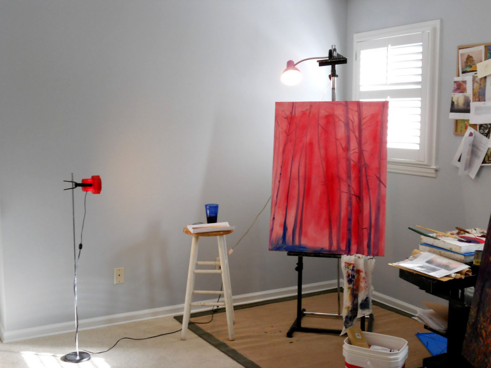
Notice how the red light and blue cup are placed in this picture. (love that!) Sometimes my influences come from the oddest (subconscious) things. When finished, this one will be a line of trees. (Gustav Klimt influence)
 And then I added some light blue sky! This is my favorite part of painting trees.
See how the forms start to take shape when I paint the negative space between the branches?Again, notice the similarity in the painting's sky color and the light blue of the walls in my studio...strange.
Below is a pointillism piece that is a little further along. It's 4 feet by 5 feet in size! That's a lot of dots. And nope, it's still not even close to finished.

Here's what it looks like up close...

Paintings aren't always pretty while they're in progress. In fact, most of them start out with bright colors, even garish colors, and then they go through a "chromatic grey" stage where I use muted tones that resemble baby food or dirt! Painting only looks like magic in the end because most folks don't see the labor-intensive, problem-solving, messy, behind-the-scenes process. That's my favorite part!
1 comment:
So fun to see the artist in work. Can't wait to see how they turn out. I like the reds and blues!
Post a Comment